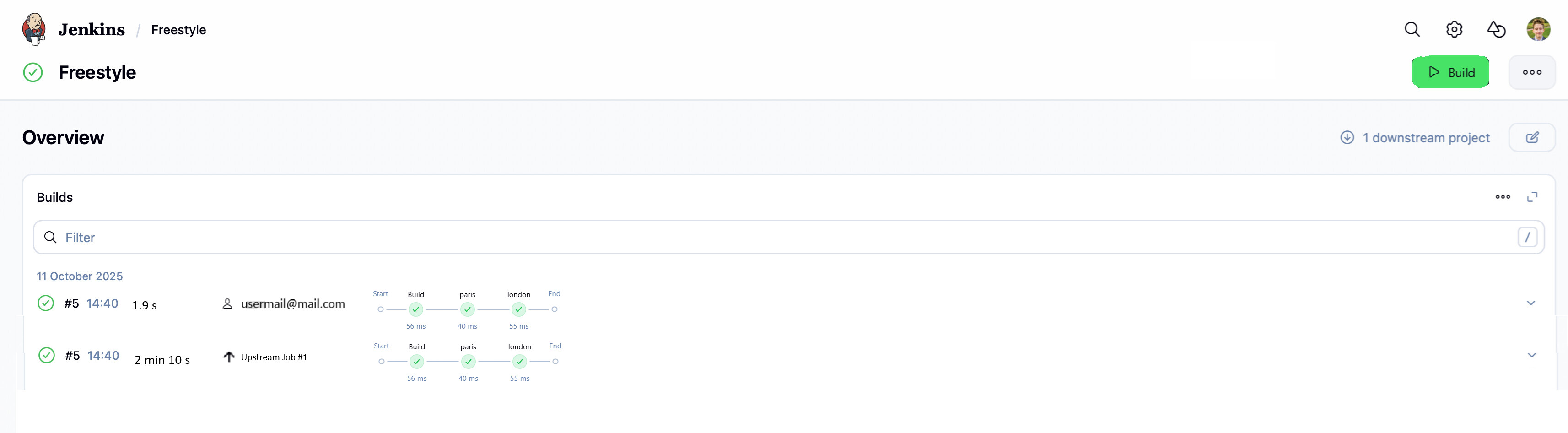
The experimental ‘Run’ page work is going well, with a lot of work now available in the latest weekly under its feature flag (enable it under user account → Experiments!).
I want to bring those same UI enhancements to the dashboard and the job pages - keeping it consistent, these would also be behind flags.
Visually I am a little torn because I like the design but all of the sudden there is so much emptiness. So much room for activities one might think, but my god is that filter input wide It becomes hard to visually connect the build result / number / name / time with additional information such as badges or texts provided by plugins.
sorry for creating spam on the Pull Request.
I guess you already answered there some of the ideas/questions I had but I still want to voice them here for better clarity.
It would be awesome if new redesign included:
allow for reordering cards and disabling them. For example in my org for some builds we delete and recreate jobs with job-dsl plugin and in such scenario Test Trends grahps are not really that needed
displaying pipeline stages. That way we have one unified view and we can display more pipeline stages and filter them (I got many requests on filtering pipeline-graph-view in my org)
one big “build button” at the right corner
and if possible nice integration with Build Trigger Badge plugin. This plugin makes it trivial to see what trigger exact build from the current builds view. Quite often I have jobs with lot of the builds spammed either by cron, or manually by different users, and seeing what’s the reason is really helpful in that case.Current design of the plugin unfortunately display all trigger tree as the badges which clutters UI a little bit. I made issue JIRA ticket to simplify that so it’s better prepared for this redesign. Here is link to JIRA ticket https://issues.jenkins.io/browse/JENKINS-76198 I’m not even sure we need this plugin as maybe simple last trigger could be displayed in the core as it was done one the build page by your PR on build cause #11128
I’m not sure if we can add it as part of this redesign:
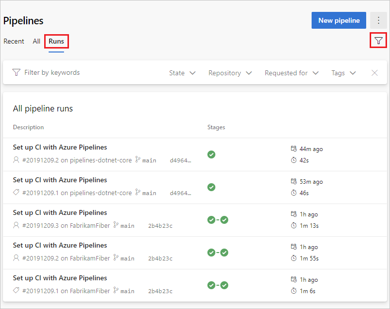
maybe we could extend search capabilities ? Currently we can filter by almost any text in the pipeline, e.g. username, mail, fail, pass, etc. But maybe we could add logical expressions to it ? Or just simple dropdowns for filtering searches ? That way for pipelines with many builds searching for failure created by user or some other condition is trivial
I don’t mean it in a bad way, quite opposite, in AzureDevOps you have everything needed to find correct build, investigate it etc. UX is not bad and we could take a little bit inspiration from other systems.
Fortunately UI is much better than what MS did !