Hey folks.
The experimental ‘Job’ and ‘Run’ page work is going well, with a lot of work now available in the latest weekly under its feature flag (enable it under user account → Experiments!).
I want to bring those same UI enhancements to the dashboard - keeping it consistent, this would also be behind a flag.
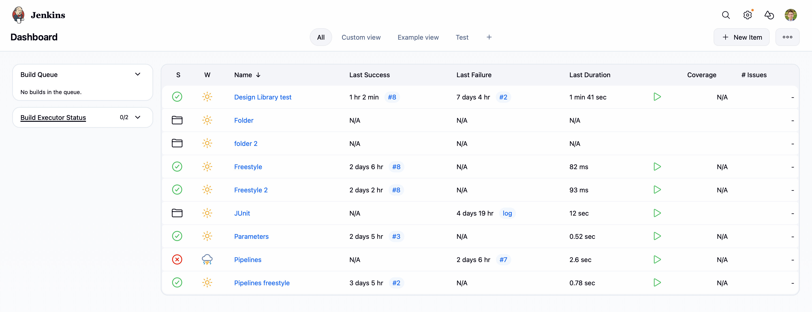
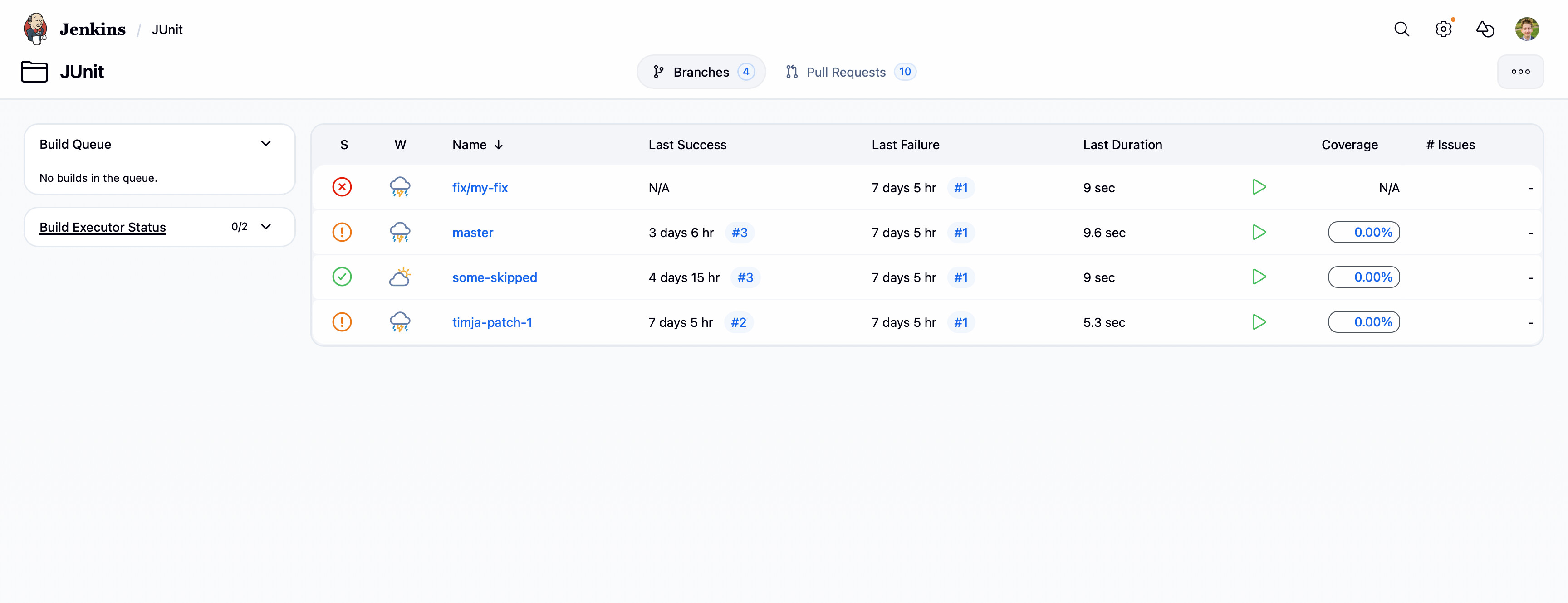
I’ve opened a PR on GitHub to get this initial work in - Add experimental dashboard UI by janfaracik · Pull Request #11208 · jenkinsci/jenkins · GitHub - I’d love to get thoughts on it, hoping to iterate often based on feedback.
The intention is to:
-
New design, consistent with jobs and builds
-
Trying to reduce Jelly duplication (E.g. folder plugin duplicates stuff from core, would be good not to)
-
App bar supports icons, so plugins don’t need to implement that themselves
-
Support for icons/badges for tabs
-
Improve performance with deferred loading
-
Revamp the table to make it more useful
-
Potentially make the ‘All’ view customisable
All the best,
Jan