I’ve been looking at redesigning the build page recently - exploring various options on how best to display the infinite options that can appear on that page.
The below is what I’ve come up with. The aim is to provider a denser, more predictable overview for builds, whilst still allowing users to drill into what they need to.
Plugins can contribute tabs for the top bar, and cards for the overview page, so you could expect to see your pipeline graph, artifacts, changes, tests, and warnings for example.
In the above screenshots, you can see the user benefits from the ‘Overview’ page (the hub of a build) - allowing them to see a dense view of build info. They can jump into the various cards, but its still easy to navigate thanks to the tabs.
I’d love to hear your thoughts, its still rather early/lacks polish - which is most evident in the cards themselves.
Another thing I would love to see is a way to easily switch between builds. The existing „Next Build“ / „Previous Build“ navigation in my opinion is cumbersome and could be improved. One idea I had in mind was to include the Build History Widget on each Build Page. I think this could nicely be included with your proposal.
I like the new design elements. It looks much better with cards!
I’m not sure if it is a good solution to move the side panel to the top as this will make the navigation more complex. Are the remaining items hidden in the “…” button? Typically, the side panel has 10-20 entries.
On the other hand, removing the side panel hopefully provides a simple way that plugins can use the full screen (100% height - header) without scrolling.
I see another problem: without user customization (e.g., a grid similar to the iPhone grid) the same problem as before is present: useless entries (in your example a huge but meaningless stage view) hide important details (like tests or coverage statistics). Allowing a user to show/hide and reorder elements is a must have… Or how is the plan to arrange the overview cards?
Regarding badges, absolutely. I think the new UI should give ample space for them to exist on this page.
The Next/Previous controls have been shifted to the top of the page (next to the build title), and I think I’ll make them a little more prominent too. Regarding the widget, definitely will be space for that, I think a plugin would be better suited for that though.
Stuff like Stages/Tests/Warnings would appear in the tabs. Lesser used actions, e.g. Embeddable Build Status, would live in the … menu.
I see another problem: without user customization (e.g., a grid similar to the iPhone grid) the same problem as before is present: useless entries (in your example a huge but meaningless stage view) hide important details (like tests or coverage statistics). Allowing a user to show/hide and reorder elements is a must have… Or how is the plan to arrange the overview cards?
I think for a minimal viable product it’d be a static grid, but the end goal is still to have users be able to customize it and change it how they want (maybe on a global and per pipeline basis).
While I do think that new design is pretty, it is however impractical. Horizontal space was never an issue, left side menu was fine as it was. It’s vertical space which I constantly struggle with on Jenkins. Having to constantly scroll down to see build logs, etc. Then have to move up to actually see side menu (… “hamburger” menu now). Also, common tasks, such as “Console Output” and “Replay”, are now two clicks instead of one. There is a reason why hamburger menus are considered a bad UX https://www.nngroup.com/articles/hamburger-menus/
Having to constantly scroll down to see build logs, etc. Then have to move up to actually see side menu (… “hamburger” menu now)
Absolutely - https://github.com/jenkinsci/jenkins/pull/11141 has just been merged which will take those important actions (Stages, logs, tests, etc) and places them centre at the top of the screen - so they’re quickly accessible. There’ll also be some investigation into making them sticky so they stay on the screen at all times.
Also, common tasks, such as “Console Output” and “Replay”, are now two clicks instead of one. There is a reason why hamburger menus are considered a bad UX
Agreed, Console will be one click away in the tab bar, and there’ll be a widget so it’s the first thing you see on the build page.
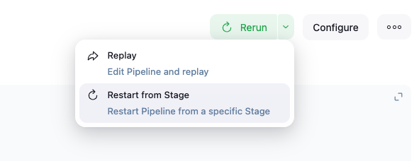
Replay will be moved out of the hamburger menu - I’m working on the API to do so now, it’s a little trickier than would be assumed.
It’ll look like Pipeline Graph View’s implementation:
One more issue that I saw our Jenkins users (mostly mid-tier developers) are constantly experiencing is that they see no difference between branch page in multibranch pipeline, and particular build page. So they constantly are searching for things like “Replay” button in wrong place.
It would be great to somehow solve this in the new design.
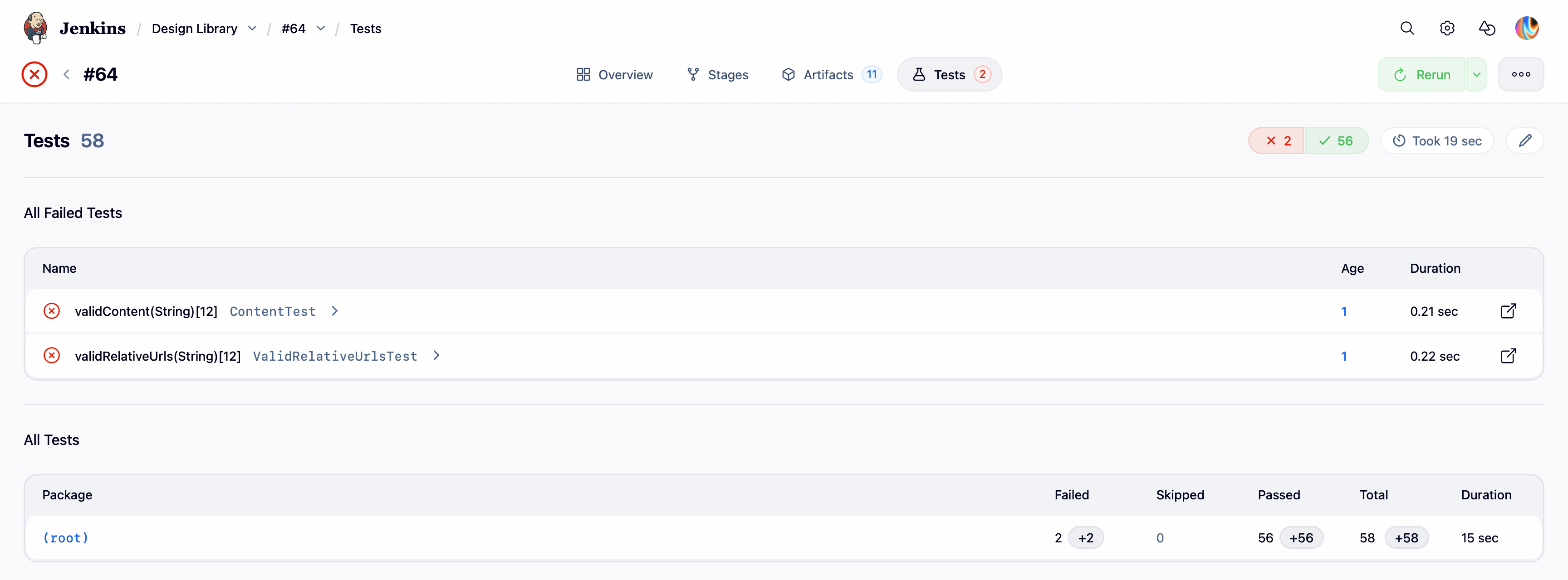
In the prototypes for the build results for tests and warnings I noticed an inconsistency that might make sense to discuss here (in the PR the comments might get lost).
When we select the test results tab, then we land on the tests index page. When we select a package, then a new sub-page opens with the package details. This click also introduces a new breadcrumb on top of the page. The tabs are still visible but somehow meaningless, and the tests are not selected anymore.
How should we handle this in the future? Shouldn’t the test results be somehow within the tests tab as well? Is it ok to create new subpages within one of the tabs, or should a tab be a single page with dynamic content? Or do we need breadcrumbs within a tab as well?