Having to constantly scroll down to see build logs, etc. Then have to move up to actually see side menu (… “hamburger” menu now)
Absolutely - https://github.com/jenkinsci/jenkins/pull/11141 has just been merged which will take those important actions (Stages, logs, tests, etc) and places them centre at the top of the screen - so they’re quickly accessible. There’ll also be some investigation into making them sticky so they stay on the screen at all times.
Also, common tasks, such as “Console Output” and “Replay”, are now two clicks instead of one. There is a reason why hamburger menus are considered a bad UX
Agreed, Console will be one click away in the tab bar, and there’ll be a widget so it’s the first thing you see on the build page.
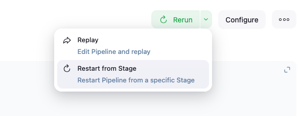
Replay will be moved out of the hamburger menu - I’m working on the API to do so now, it’s a little trickier than would be assumed.
It’ll look like Pipeline Graph View’s implementation: