Hey folks.
I’ve been working away on an improved Manage Jenkins experience and I’d love to get your thoughts.
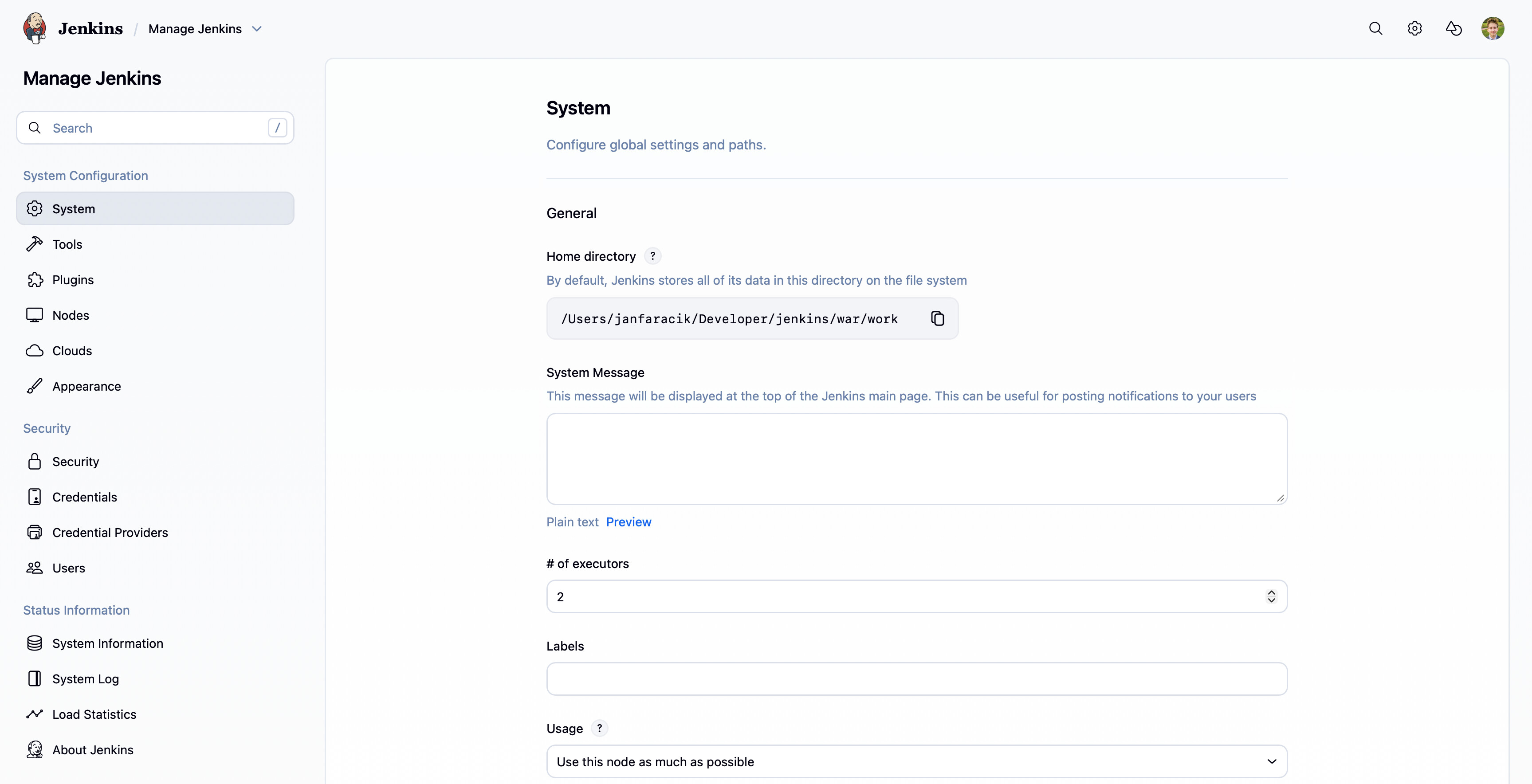
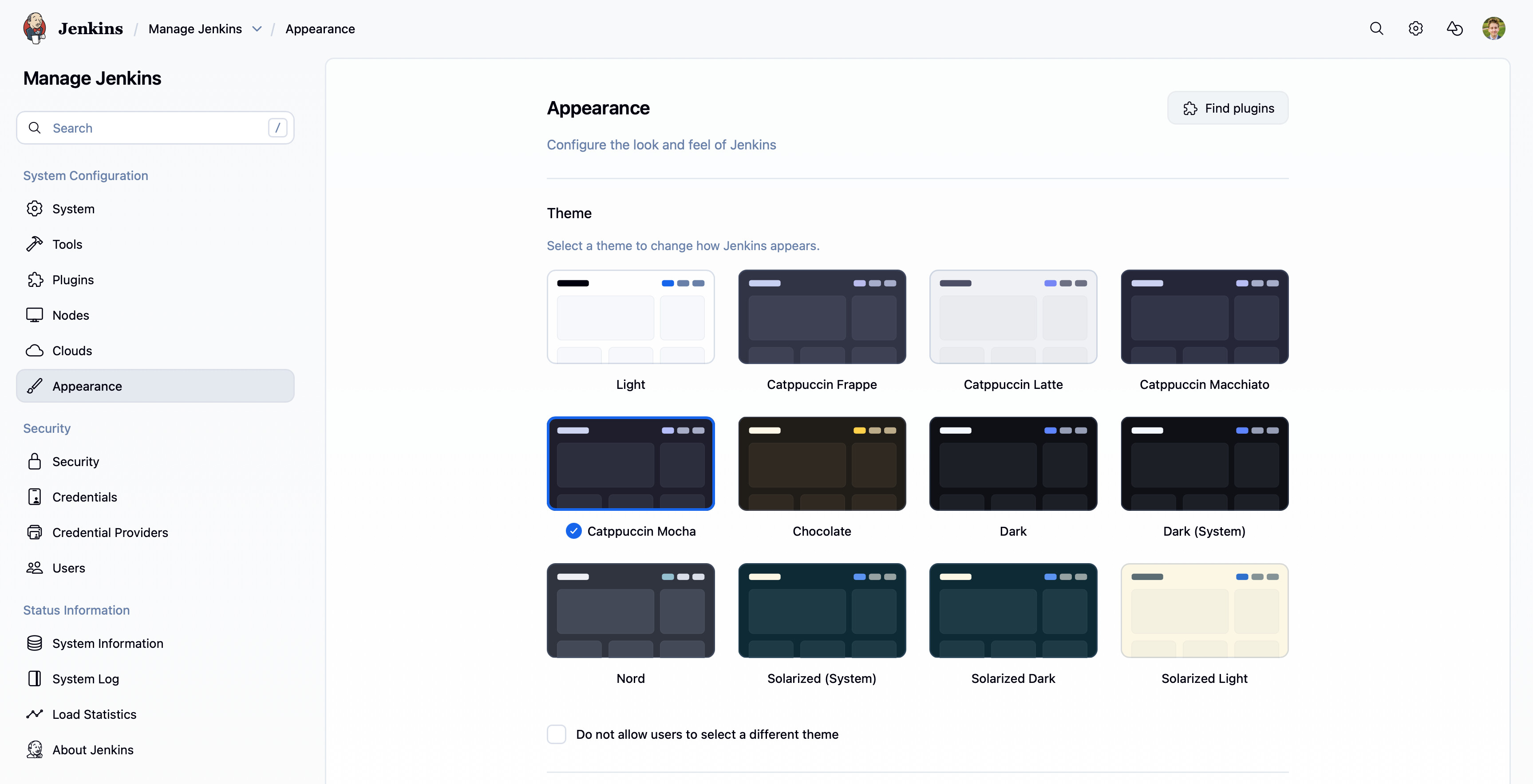
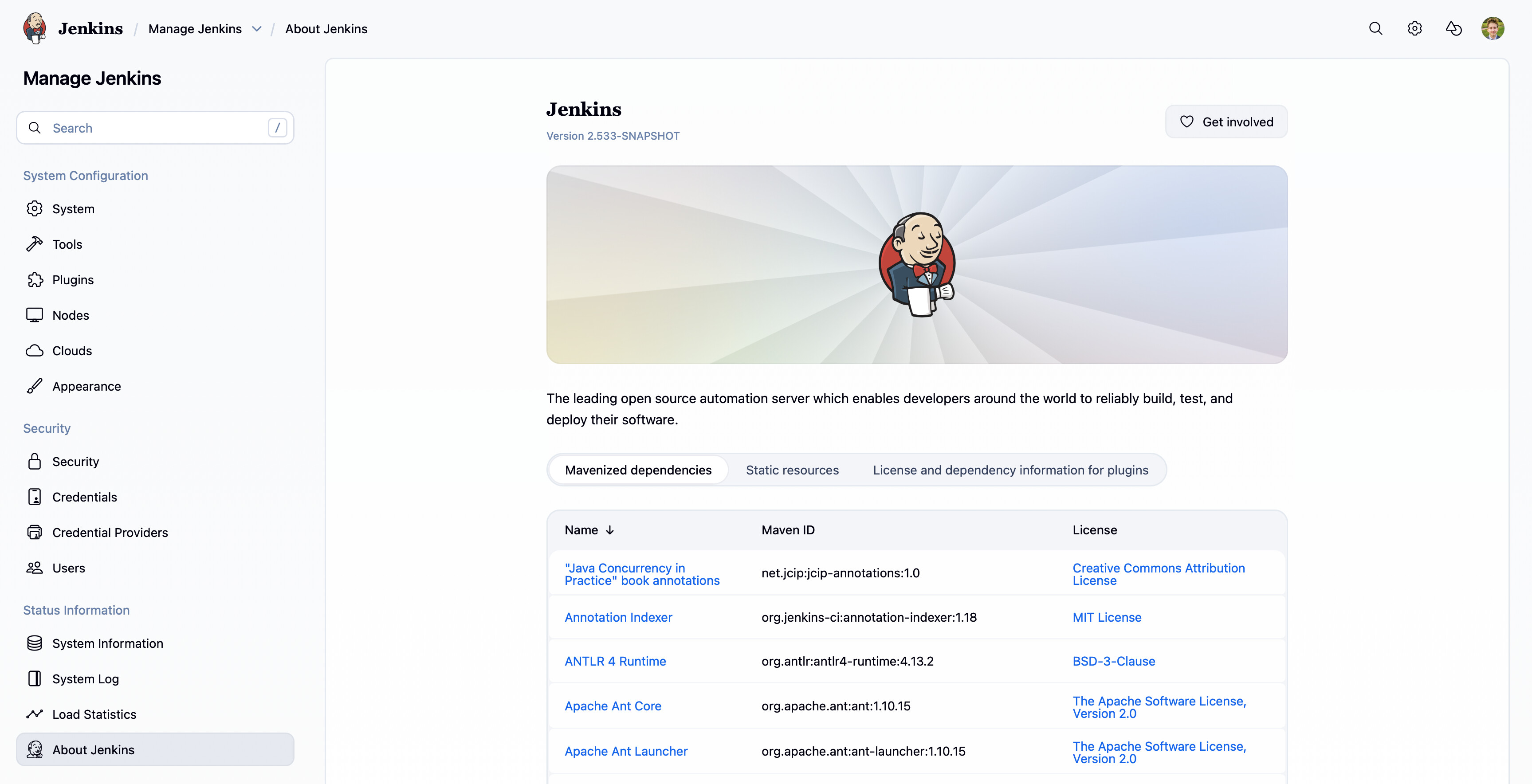
What’s changed?
-
New sidebar and design for easy switching between settings
-
Alerts now show on the ‘System’ page
-
Added
settings-subpage- reusable frame for Manage Jenkins pages -
Page contents are deferred, meaning that swapping from page to page is near instant
This is currently behind a feature flag, whilst the rest of core and plugins are updated to align with the design.
PR is here Add experimental Manage Jenkins layout by janfaracik · Pull Request #11222 · jenkinsci/jenkins · GitHub - and UX Sig issue is here Use a side panel in Manage Jenkins · Issue #10 · jenkinsci/sig-ux · GitHub.
I’d love to hear your thoughts, its still rather early/lacks polish.
All the best,
Jan